JRPGs are a genre that has you looking at many menus, even in combat. Let’s take a look at what makes the menus and UI in Persona games stand out and why presentation matters in JRPGs especially.

Why do menus and UI matter in JRPGs?
UI, or user interface, is a huge factor in what makes a game visually pleasing and enjoyable to play. A bad or clunky UI can absolutely ruin an otherwise great gaming experience. Most of the time, UI and menus in games favor function over form. However, really good UI can absolutely elevate a game, especially in JRPGs
Every game has menus to navigate, but it’s crucial in JRPGs. Think of how much more time you spend in menus in games like Final Fantasy than Devil May Cry. The former checks stats equips multiple pieces of gear, deals with a skill tree, and the list goes on.

It matters even more in JRPGs as most games in the genre have turn-based combat systems. This means your entire combat is more or less, navigated through menus. You can see why, then, that menus need to be visually pleasing while also offering up functionality.
What sets Persona game menus apart?

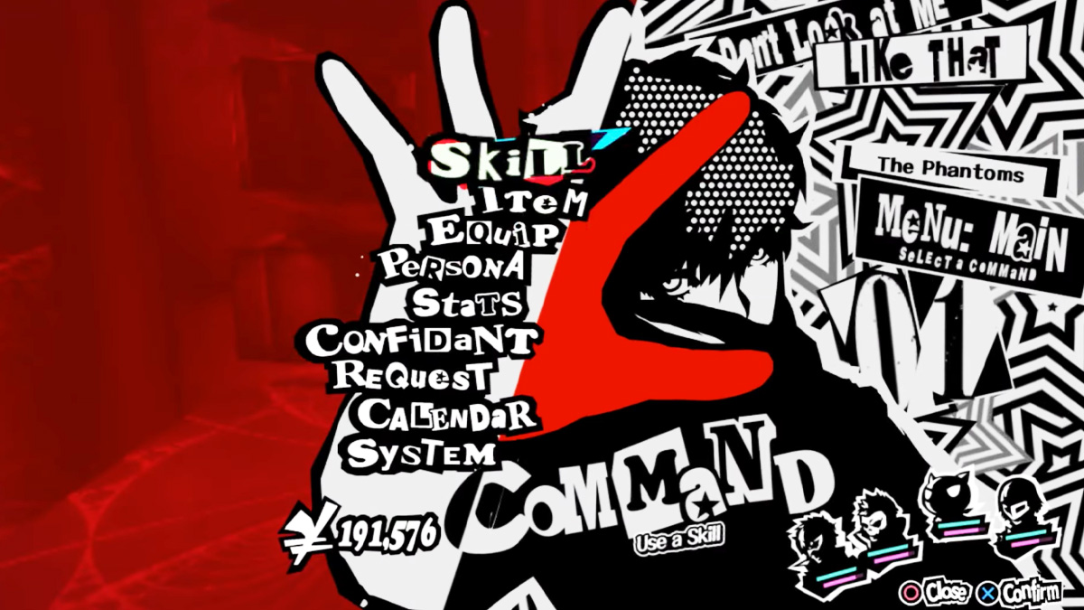
The Persona game menus are a masterclass in presentation. They not only ooze style, but they are also simple and functional. Look at Persona 5, for example. In combat, the available actions circle the chosen character. This is similar to action or dialogue bubbles in manga.
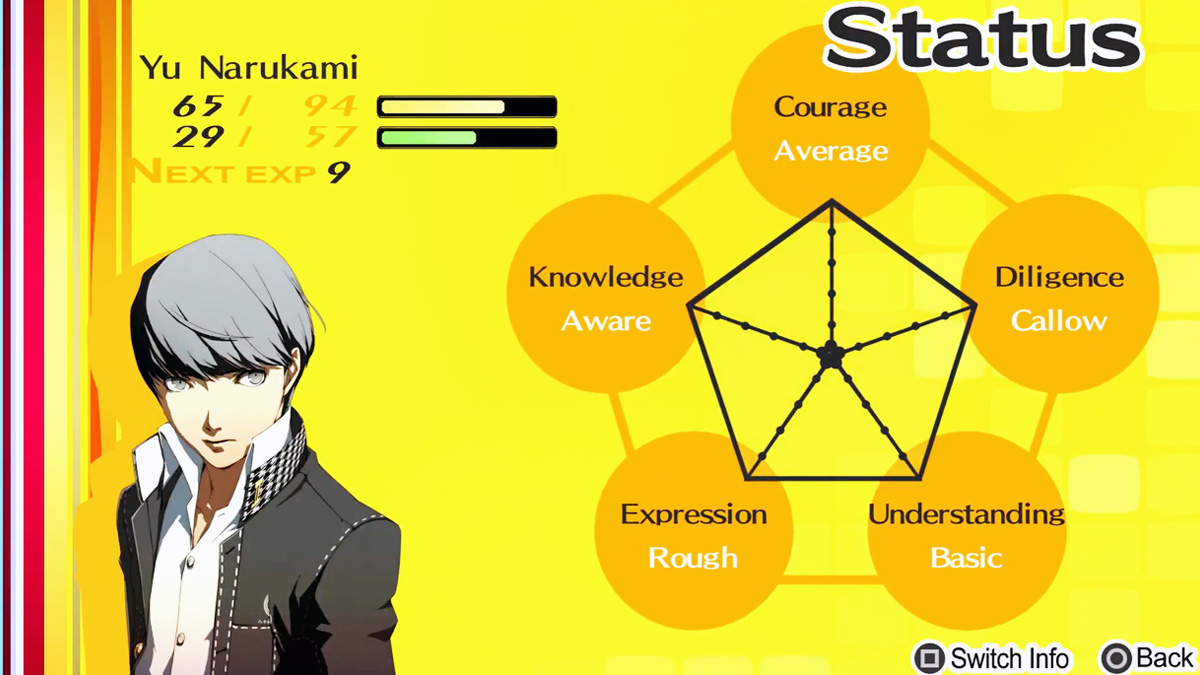
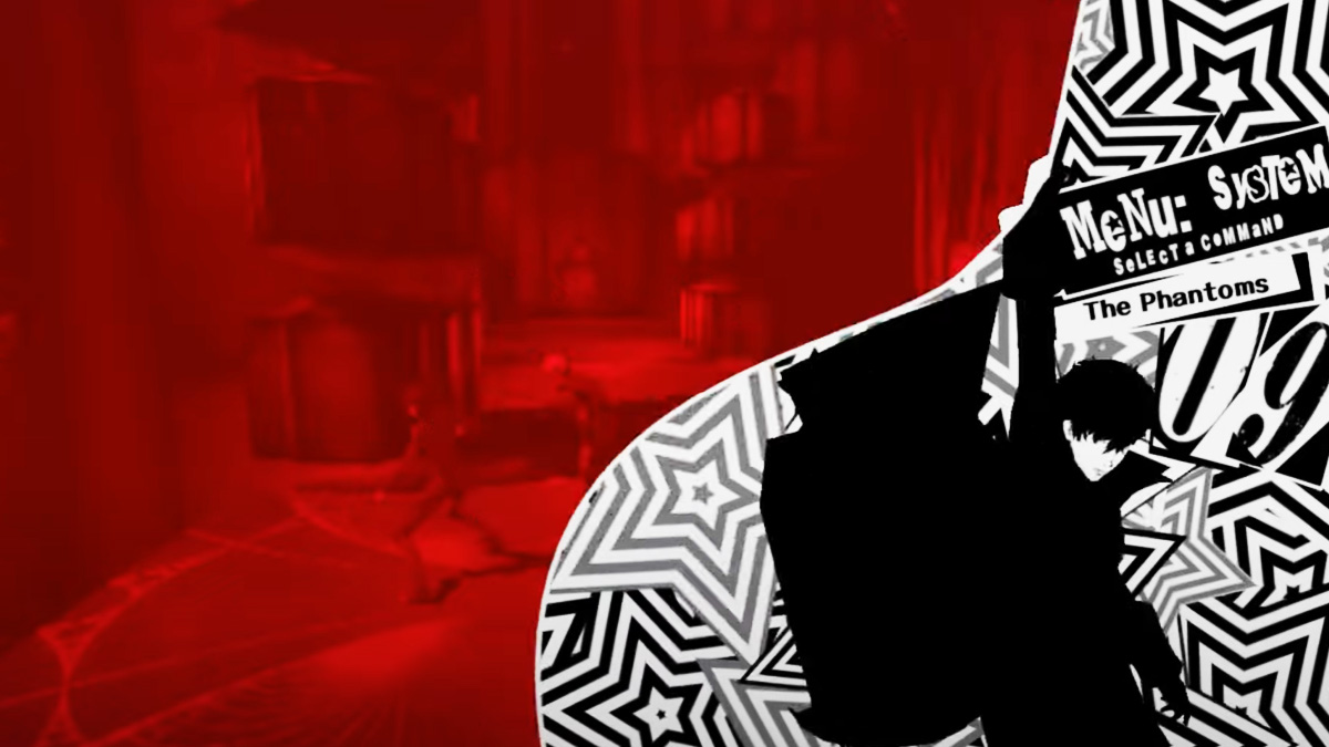
This same aesthetic follows through all the menus, giving the overall game the same “vibe,” for lack of a better word. I think that’s why Persona games are so recognizable: they have a strong visual presentation. Every menu and submenu follows the style and usually has more detail and color than peers in the genre.
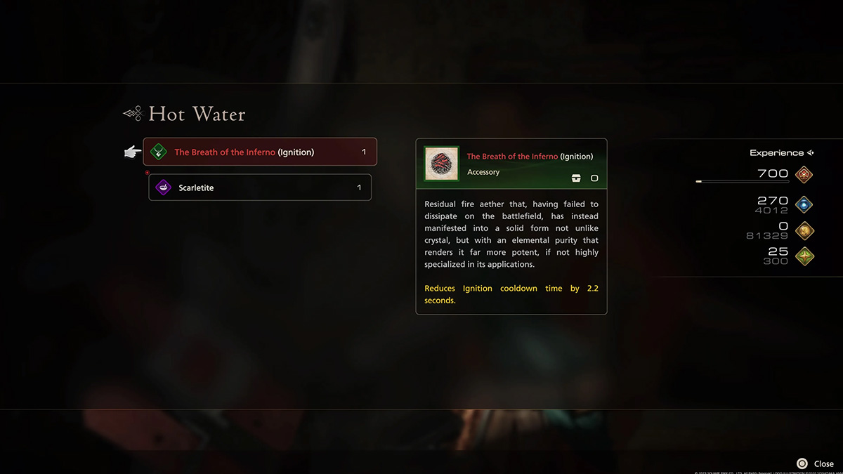
Keep in mind that this doesn’t mean any other variety of UI is bad. Final Fantasy XVI, for example, has very sleek and clean menus. These are easy to navigate and fit that game way better than something like Persona’s style would. It’s all about art direction, and I just feel that one of, if not the thing, Persona games do best.

To put it in movie terms, let’s look at someone like Wes Anderson. The way Anderson uses shot composition and color palettes is so unique to his films. You can identify his work from a single frame from one of his films.
This is how Persona games feel. Because of the way they use color even, you can easily separate one Persona game from another from just a screenshot. This, ultimately, immerses you more and makes you feel like what you’re playing is an experience. Or. dare I say, a piece of art.


Published: Jan 31, 2024 03:30 pm